How we helped a healthcare & skincare product start-up bring out the brand’s true essence through brand identity and packaging design.
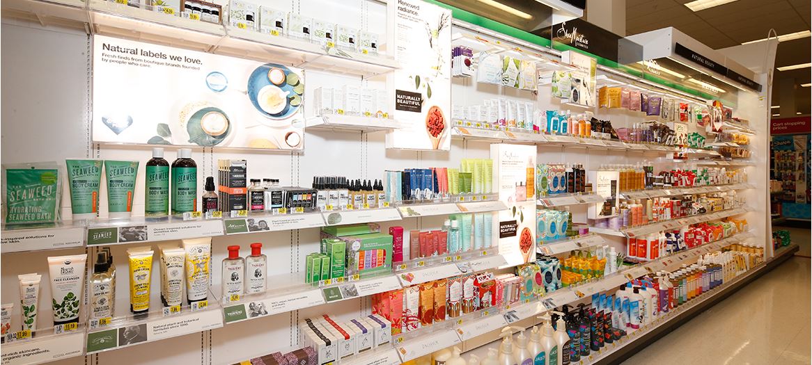
As life in Indian cities gets more complex, people are beginning to return to traditional Indian ways of life – yoga, ayurveda, organic food, etc. – almost as some form of subconscious defence mechanism. Leveraging this insight, several Indian companies have been getting into natural health-related products and services.
One such start-up reached out to White Cloud Brands to help them create a distinct brand identity and packaging design.

Considering the size of the opportunity, India already has a significant number of both established and young companies marketing natural products for both external application/usage as well as for consumption. Creating a genuinely differentiated identity would be crucial for the success of the product range.
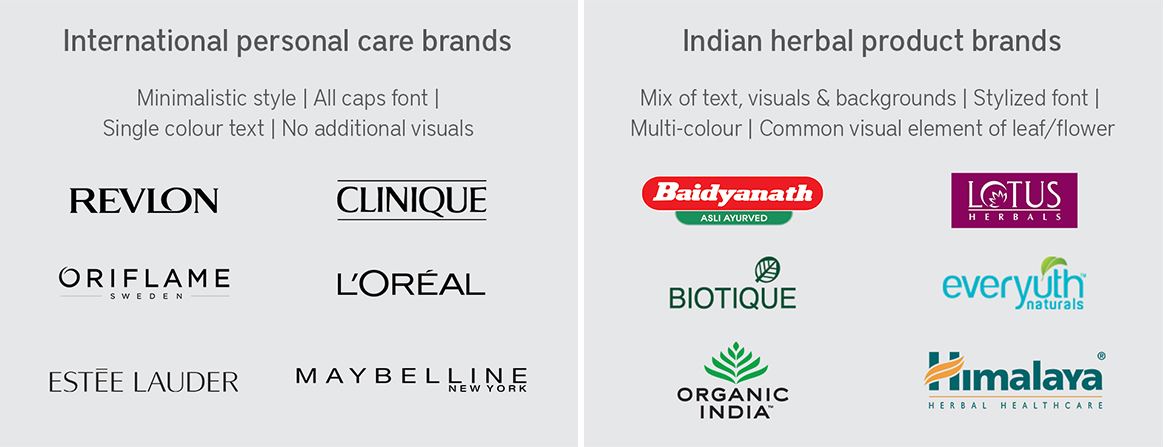
Additionally, while the brand identity had to have a certain universal appeal (with global logos and packaging designs usually being minimalistic), it also had to have a certain attention-grabbing appeal required for success in the Indian retail segment.
The client wanted White Cloud to
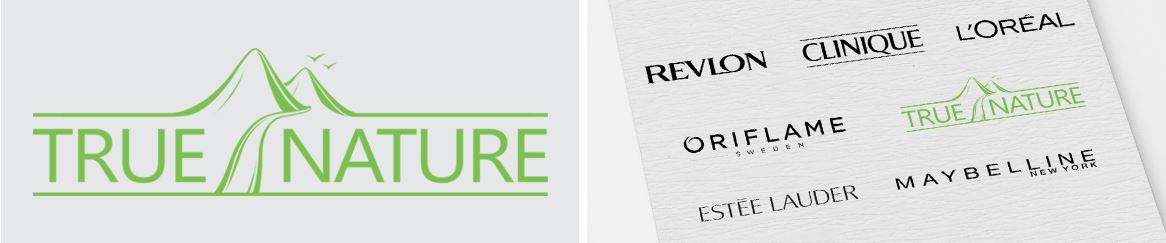
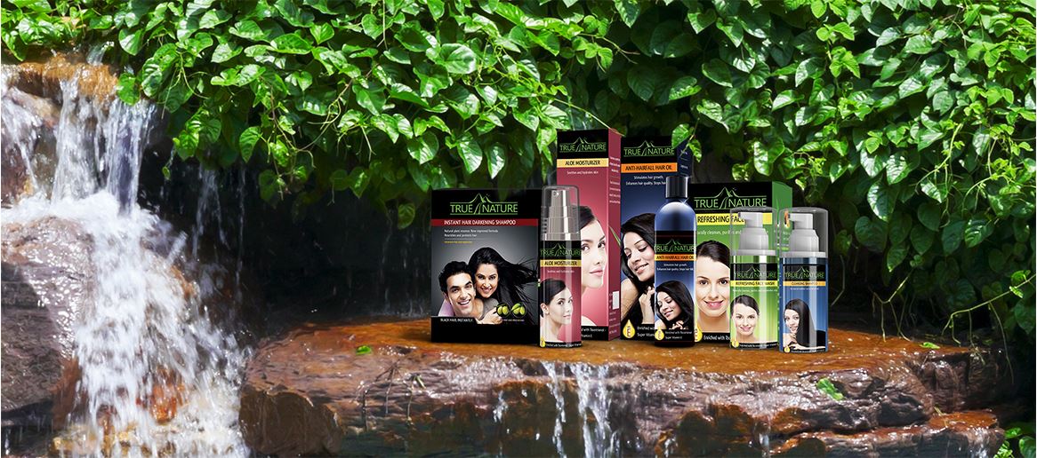
In keeping with the nature of products being launched, we suggested ‘True Nature’ as the name. The term 'True Nature' has connotations of ‘one’s true self’ as well as ‘purity of ingredients’, both of which were integral to the client’s customer value proposition.
For the logo design, we worked towards an option that would combine the minimalism of global healthcare & skincare product logos with elements of nature. A benchmarking exercise of both kinds of logos – global product companies and Indian natural/ayurvedic product companies – was carried out, as the client’s brand would be competing with both on the shelves.
The logo ultimately designed had a minimalistic global appeal, while bringing out aspects of purity through hand-drawn illustrations of elements of nature.
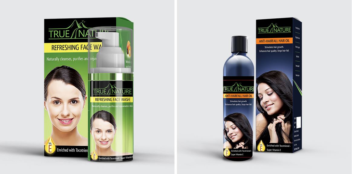
For the packaging, we decided to continue the ‘light’ feel of the logo using thin sans serif fonts for the text, solid background colours and one single image reflective of the specific product’s benefits. One key benefit was further highlighted on the front through a standalone graphic element. The sides and back of the package were kept minimalistic, with product benefits and ingredients, to further enhance trustworthiness in the brand.


The brand identity and packaging design helped position the client favourably in front of investors, suppliers and the trade, enhancing their credibility and laying the ground for launching their products successfully. Moreover, the insights and suggestions provided by White Cloud Brands during the exercise (relating to changing customer needs, desired brand positioning, messaging narrative, etc.) continue to be leveraged by the client in their marketing initiatives.


